TORONTO (Dec. 21) — With Christmas 2019 just around the corner, it’s time for a little fun. Time to forget, briefly, the contract conundrum in the immediate future of Toronto Maple Leafs general manager Kyle Dubas. And, whether Mike Babcock is again destroying his No. 1 goalie before the playoffs. Today, instead, is devoted to frivolity. To agreeing, or disagreeing, with my personal selection of the Top 20 National Hockey League jerseys in the modern era (post–1945). For this, of course, we turn to none other than http://nhluniforms.com/ — undoubtedly, one of the most–addictive hockey websites. My pal, Andrew M. Greenstein, has done a marvelous job updating his unique data–base since its creation in 2001.
Andrew provided hundreds of jerseys to choose from in the post–1945 NHL era, yet I found it rather easy to pick my Top 20. Without question, I’ve either rated jerseys too loftily for your taste, or have omitted those you believe should be amid such exclusive company. Whatever the circumstance, I hope you’ll enjoy perusing how I’ve justified my choices… and will offer feedback for the Comments section at the bottom.
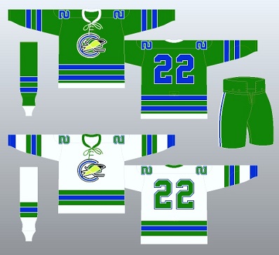
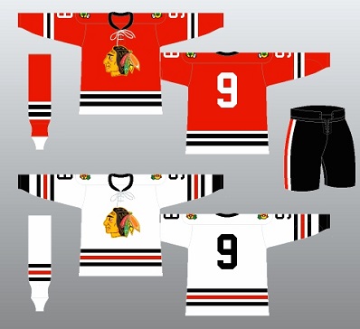
No person familiar with me will be surprised that I remain enraptured by the original uniform of the California Seals in 1967-68 (top–left). Green has long–been my favorite color and the Seals were the first of the expansion teams I saw live (in their initial visit to Toronto — Oct. 28, 1967). I’ll never forget how their green road–pants (worn with the white road jersey) radiated beneath the luminescent band of TV lights on the west side of Maple Leaf Gardens. And, the Seals captain, Bob Baun, had been among my earliest Leaf heroes. For those wondering “California Seals?”, they joined the NHL in the Great Expansion of 1967–68 with the Los Angeles Kings, Minnesota North Stars, Philadelphia Flyers, Pittsburgh Penguins and St. Louis Blues. After nine seasons of pitiable attendance in Oakland, the franchise moved to Richfield, Ohio (for 1976–77) as the Cleveland Barons (more later). All hockey fans are familiar with the iconic red jersey of the Chicago Blackhawks (top–right). It is often cited as the best uniform design in league annals and has remained mostly unchanged since being introduced for the 1955–56 season. This version — with the black neck–collar and white tie–strings — was worn by Bobby Hull (No. 9) at Chicago Stadium in the early–1960’s.
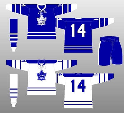
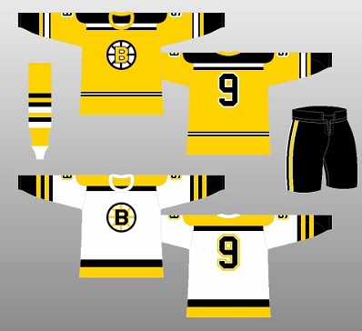
How could I not highly rate the blue jersey (top–left) in which Dave Keon (14) of the Toronto Maple Leafs was attired during my first live NHL game: at the Gardens against Detroit, Dec. 3, 1966? It remains the most–handsome design the Leafs have presented in my life — worn by the club from 1963–64 to the end of the 1966–67 regular season. The best Leaf road jerseys? Predominantly white with a blue shoulder–yoke (1958 to 1970), as above. During the 1966–67 season, I also saw the Boston Bruins play at the Gardens. Though terribly disappointed that rookie defenseman Bobby Orr was sidelined with a knee injury, I immediately took to the white road jersey with the yellow shoulder–yoke (top–right, worn by No. 9, John Bucyk) that also shone brightly beneath the Gardens’ TV lights. I somehow remember young players Glen Sather and Ron Schock, wearing crew–cuts, skating around with Boston during the warm–up. The Bruins wore their white jerseys on the road and at home in 1966–67. They introduced a black home jersey the following year.
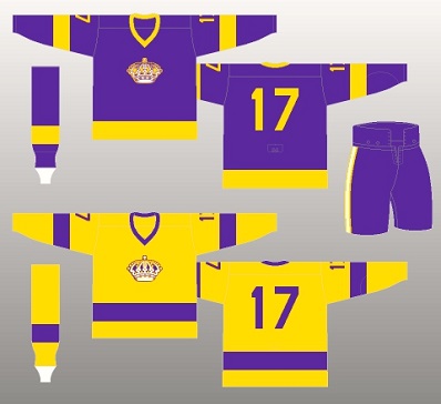
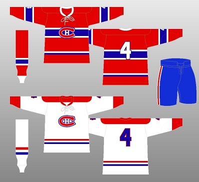
Among the six expansion teams for 1967–68, the Los Angeles Kings introduced purple to the NHL (top–left, Bill Flett No. 17) and a puzzling (for me) road jersey that was not predominantly white. The Kings wore gold uniforms and purple pants away from home; the other 11 teams had white road jerseys. As an eight–year–old, that didn’t make sense, but I thought the gold jerseys looked amazing under the bright TV lights of Maple Leaf Gardens. Kings founder Jack Kent Cooke abhorred use of the word “purple”, considering it un–manly. He and his acolytes referred to the color as “Forum blue”, after the new arena he built in suburban Inglewood. Los Angeles changed its colors to black, silver and white upon Wayne Gretzky’s arrival from Edmonton in 1988–89. The legendary bleu, blanc et rouge of the Montreal Canadiens comes in sixth on my list — as worn (top–right) by captain Jean Beliveau (No. 4) in the mid–1960’s. This jersey combo has remained virtually unchanged since being introduced by the Habs for the 1947–48 NHL season.
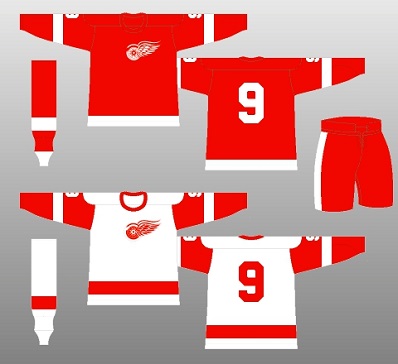
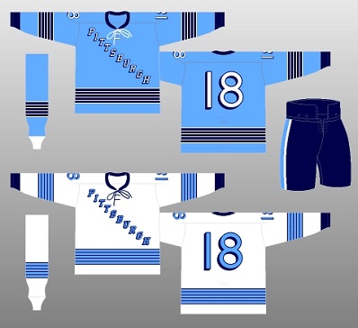
Also unchanged, for the most part, has been the jersey combo of the Detroit Red Wings (top–left) since the club introduced an all–red sleeve (with white stripe) on the road edition for the 1961–62 season. I remember being mesmerized by Gordie Howe wearing his famed No. 9 in my first–ever game at Maple Leaf Gardens, 52 years ago this month. The simple red–and–white color scheme is among the all–time best in the NHL. The Pittsburgh Penguins arrived in 1967 with a rather plain, but unique, jersey design — the city’s name displayed diagonally across both the home and away versions. Pittsburgh introduced light (or powder)–blue to the NHL and wore these uniforms only during its inaugural campaign. For 1968–69, the Penguins placed their round logo on the jersey–front and added shoulder–yokes (white at home; light–blue on the road).
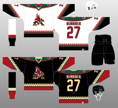
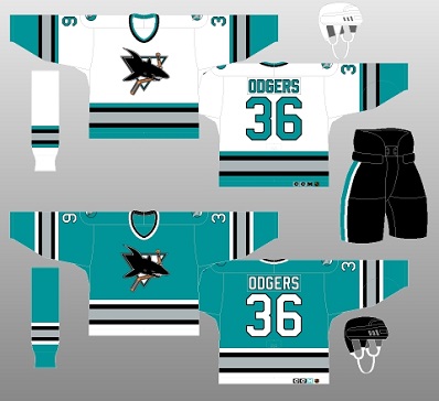
Original jerseys of more–recent expansion (or re–located) teams easily rank among my Top 20. No uniform in NHL history has better–represented its region than the classic, southwest design of the Phoenix Coyotes (top–left). The original Winnipeg Jets moved to Arizona for 1996–97 and came up with this handsome color–scheme of black, dark–red, sand, dark–green and purple. The black road jersey, in particular (as worn by No. 27, Teppo Numminen), was remarkably stunning and detailed. The Coyotes moved to their current desert–red color for the 2003–04 season. The San Jose Sharks (top–right) arrived in the one–team expansion of 1991–92 and introduced teal to the NHL. Playing, for two seasons, at the ancient Cow Palace in San Francisco, the Sharks returned big–league hockey to the Bay Area (the California Seals having left 15 years earlier). San Jose’s predominantly–teal road edition (as worn by roughneck Jeff Odgers, No. 36) quickly became the NHL’s best–selling jersey. Why the Sharks changed this design in 1998 is still a mystery.
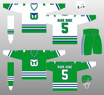
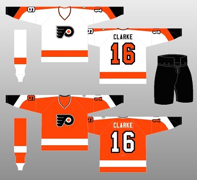
Gordie Howe, Dave Keon and Bobby Hull wore the green–and–white Hartford Whalers jersey (top–left) in 1979–80, when the franchise was absorbed by the NHL from the remnants of the World Hockey Association. Gordie’s son, Mark Howe (No. 5), became a legend during his brilliant career (1979–95), played mostly with Philadelphia. He joined his father in the Hockey Hall of Fame as part of the 2011 inductees. Keon and Gordie Howe each scored goals in Hartford’s first visit to Maple Leaf Gardens (Oct. 31, 1979) as the Whalers dumped the Leafs, 4–2. Both received standing ovations. It was 5–3 for Hartford in the return match, two nights later, at the Civic Center in Springfield, Mass. The Whalers changed to predominantly–blue road jerseys from 1992–97, before moving to North Carolina (as the Hurricanes). And, who can forget Bobby Clarke wearing the classic orange–and–black of the Philadelphia Flyers (top–right) during back–to–back Stanley Cup seasons (1974/1975)? These remain the best of Philadelphia’s uniform designs and are almost identical to the version worn by the club today. Philly introduced orange to the NHL in the 1967 expansion.
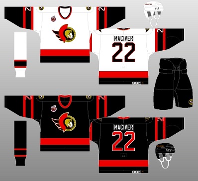
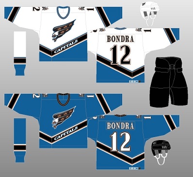
Various permutations over the past quarter–century have failed to equal the original jersey of the Ottawa Senators (top–left). The club debuted in the 1992–93 season with a horrible record (10–70–4) yet featured this wonderful uniform design, which gave way, in 1999, to predominantly red. The black version with red stripes and the original Senators logo is easily the most–attractive in the 26–season history of the franchise. Between 1996 and 2007, the Washington Capitals moved away from their original — and current — color scheme of red, blue and white. By doing so, they came up with, in my view, with the best jersey since the franchise inception in 1974. This light shade of blue, trimmed in black, bronze and white (worn by Petr Bondra, No. 12), was seen across North America during the 1998 Stanley Cup final, in which the Capitals, coached by Ron Wilson, were swept by Detroit. Washington returned to its original colors in 2007–08.
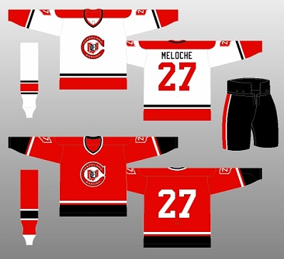
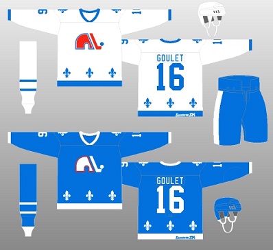
On six occasions during the 1976–77 and 1977–78 seasons, I had the opportunity to watch the Cleveland Barons from my season tickets in Maple Leaf Gardens. The scarlet–red jerseys and black pants (top–left) looked terrific — even from way up in the south–mezzanine Blues, behind and to the left of the goal the Leafs defended in the first and third periods. One occasion in particular stands out: Sunday, Nov. 28, 1976. I spent the afternoon freezing half to death at old Exhibition Stadium as Ottawa beat Saskatchewan in the ’76 Grey Cup. It was then on to the Gardens for a 5–1 Leafs pounding of the Barons, who played their home games at the Richfield Coliseum, halfway between Cleveland and Akron. Having moved from Oakland, the club fared no better at the gate in Ohio and ultimately merged with the Minnesota North Stars after two futile seasons. The first NHL uniform of the Quebec Nordiques (top–right) in the 1979–80 absorption of WHA left–overs smartly represented the province, with little fleur–de–lis emblems on the shoulders and above the bottom–jersey stripe. The powder–blue–and–red looked sharp, as did the white logo (outlined in red) on the blue road uniform. A year later, the Nords colored in the logo red, as on the white home version. The Quebec franchise moved to Denver in 1995–96 as the Colorado Avalanche.
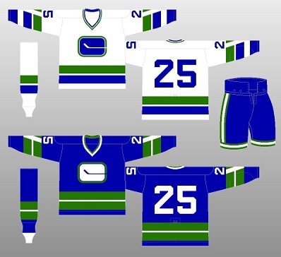
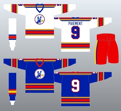
Such teams as the Calgary Flames and Philadelphia Flyers have returned to their original jerseys, so why not the Vancouver Canucks? After years in the fashion wilderness — remember the gaudy ‘V’ uniform of the late–70’s (bright yellow) that a psychologist said would intimidate the opposition, only to make rival players laugh? — the Canucks have gone back closely to their roots: the blue, green and white color–scheme. As with Ottawa, no Vancouver jersey matches its original (top–left) from 1970–71. With the ‘V’ smartly placed in the sleeve–stripe, home and away. Sadly, the Canucks removed the ‘V’ and changed the stripe–pattern after Year 1. Today, ownership insists on placing the Orca Bay logo, rather than the original stick–in–rink, on the jersey front. Otherwise, the uniform is solid, with the first franchise colors. And, I’ve always liked the Kansas City Scouts‘ look from 1974–76 (top–right). The colors (blue, red, gold and white) combined nicely and the red pant, worn at home (with white) and away (with blue) was a perfect compliment. After two miserable seasons in K.C., the Scouts moved to Denver as the Colorado Rockies and maintained the color–scheme. In 1982, the Rockies re–located in New Jersey, as the Devils, and changed to red, green and white (more later).
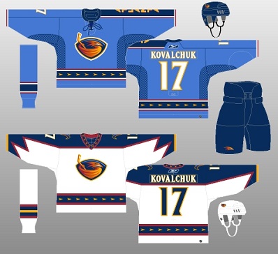
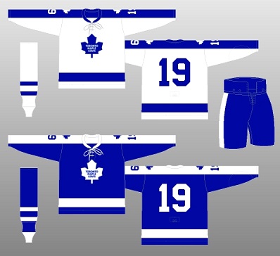
Among the most–unique designs in modern NHL history belonged to the Atlanta Thrashers (top–left) between 2003 and 2011 — at which point the franchise upped and moved to Winnipeg. The powder–blue home jersey featured a number on the right sleeve and “ATLANTA” over–top navy (written in gold) on the left. The club–logo was cool and looked even sharper on the white road jersey. To finish, I chose the Toronto Maple Leafs uniform of 1970–92 (top–right). The white jersey debuted on Oct. 14, 1970 for the club’s home opener against St. Louis. The Leafs wore their 1967–70 blue uniforms for the first seven road games of 1970–71, until the new blue version was ready on Nov. 15, vs. New York, at Madison Square Garden. Sadly, it is remembered as the “Harold Ballard” jersey… and the club never won a thing during its tenure. But, consider the Leaf legends that wore the uniform: Jacques Plante, Bernie Parent, Norm Ullman, Paul Henderson, Ron Ellis, Dave Keon, Bob Baun, Darryl Sittler, Lanny McDonald, Borje Salming, Ian Turnbull, Dave (Tiger) Williams, Rick Vaive, Doug Gilmour (for half–a–season, in 1991–92). It was only the second NHL jersey (after the Philadelphia Flyers) to present a full–arm yoke, but Ballard should never have changed the logo. Nor should the Leafs have maintained the logo as primary for 46 freakin’ years (1970–2016).
HONORABLE MENTION…
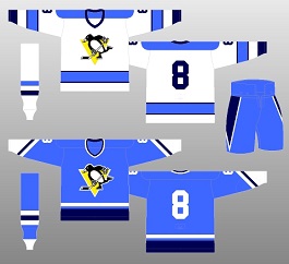
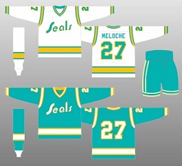
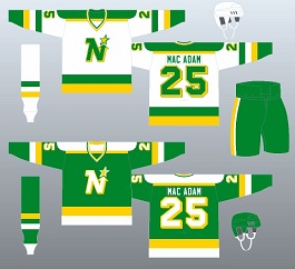
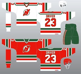
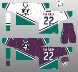
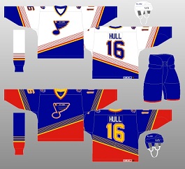
These jerseys just failed to make the cut. Top (left–to–right): the Pittsburgh Penguins in 1975–76; the California Golden Seals during their final two years in Oakland (1974–75 and 1975–76); the prime color known as “Pacific blue”; the Minnesota North Stars from 1979–81, including the uniforms worn against the New York Islanders in the ’81 Stanley Cup final. Bottom (left–to–right): the original New Jersey Devils design (1982–92), with red and green, rather than today’s red and black; the Anaheim Mighty Ducks (1993–2006), who introduced concord–grape as a primary color to the NHL and a logo based on a Walt Disney movie; the St. Louis Blues (1995–98), with the angled–red stripe at the bottom of the blue road jersey. This uniform was worn by Wayne Gretzky (after the trade deadline in 1995–96) and Brett Hull (No. 16).
BEST TODAY…
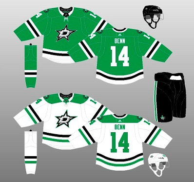
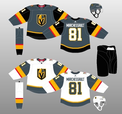
Twenty years after re–locating from Bloomington, Minnesota, the Dallas Stars introduced the best uniform in club history (top–left) — the kelly–green, black and white design that debuted in the 2013–14 season. And, the Vegas Golden Knights did everything well in their inaugural NHL campaign last year: design a gorgeous uniform (top–right) and become the first expansion club in any sport (also, likely, the last) to make it to the league championship, losing to Washington.
Up next: My 20 least–favorite NHL jerseys.
EMAIL: HOWARDLBERGER@GMAIL.COM















Kudos, Howard, on your selection of the original Oakland Seals togs as best of the modern era. For best all-time, I’d humbly suggest the home uniforms the New York Americans wore from their inception in 1925 to 1937. I can only imagine how those would have gleamed under TV lights. The HHOF in Toronto sometimes has an original 1925 Americans uniform on display.